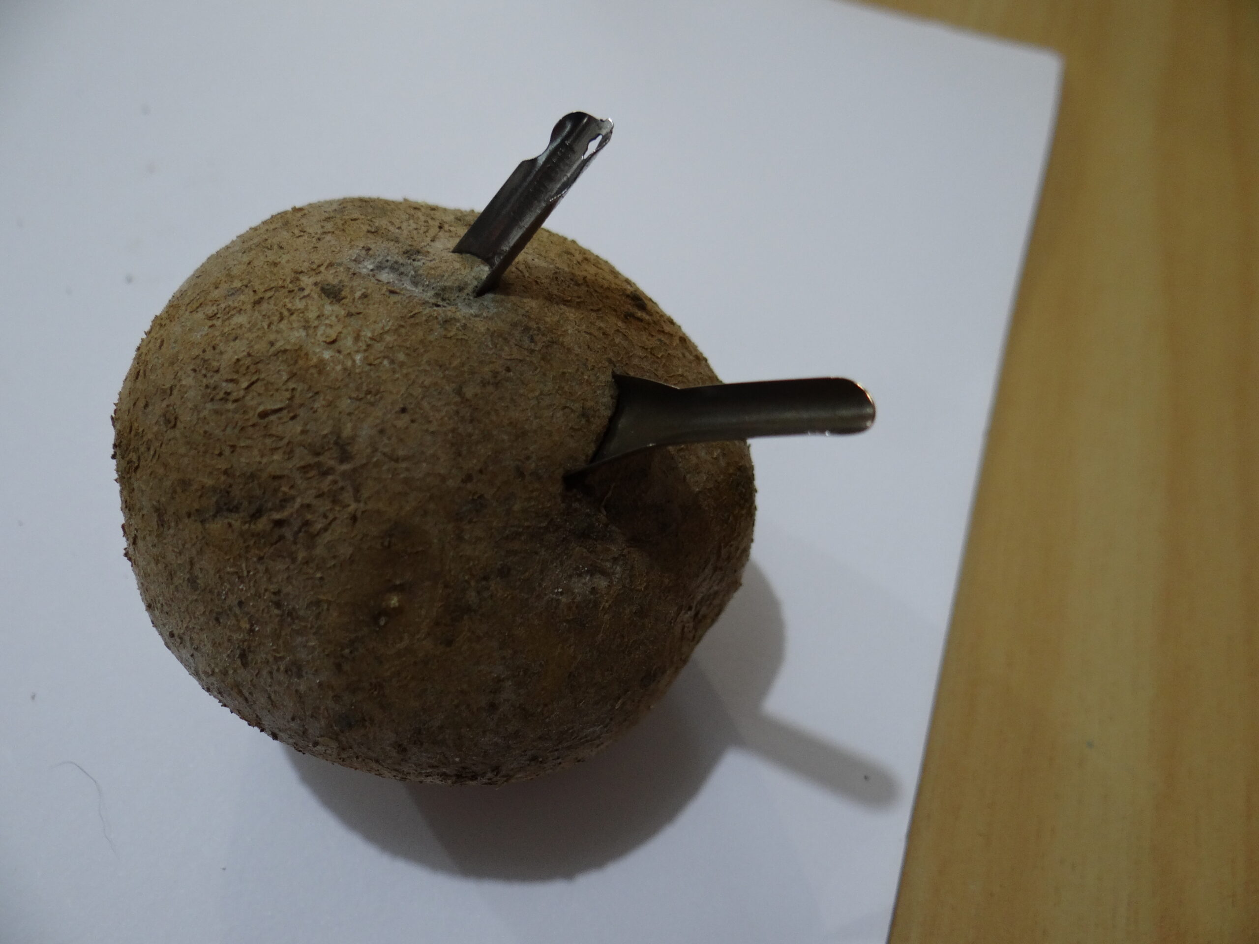
Figure 1: Before you use nibs, stick them in a potato to remove the oils.
When I was at primary school (we don’t need to say how long ago this was), I remember obtaining a calligraphy pack from the Book Club. For a while, I thought all that fancy lettering was pretty cool. Then I grew up and forgot about it.
Much to my surprise, many years later, I found myself working away here at Easyink adding new products to the web shop called things like “nib” and “nib holder” and “calligraphy ink”. Hmm. People still do that, huh?
To date, most of our expertise has been in those interesting boxes of electronics and machinery that churn out beautiful computer-generated written things, but here we are with the opportunity to supply hand-writing enthusiasts with great products. It’s a step up from the generic stationery we’ve stocked for the last few years. We aim only to sell products we can endorse, that we really believe will work well for our customers. We also want to be able to give you good advice and answer questions about our products. So…..I had to try some of these products out. For you!
(Yeah, yeah, I admit it, I kind of just wanted to play with the cool new stuff…..)
So…..we are not calligraphy experts. I’ve been reading around books and blogs and product information and reviews to acquire some background knowledge. I found The Postman’s Knock blog has great instructions for calligraphy beginners. She has great photos of the correct installation of nibs in holders. Aim the centre of the nib into the gap in the metal prongs inside the end of the nib – it will slide in nicely and sit securely when it’s in the right place.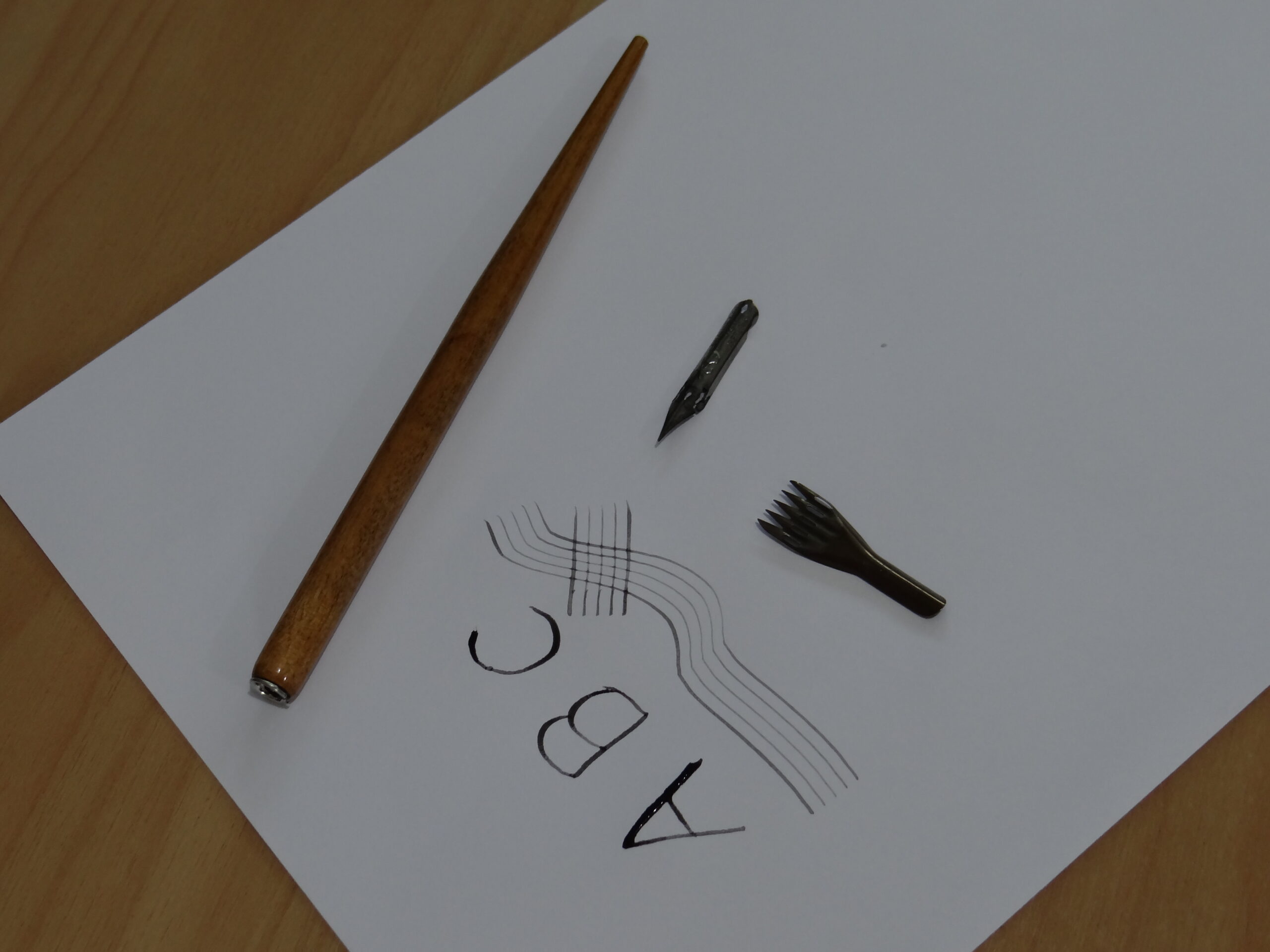
Before use, though, she says nibs come covered in oils, and to stick them in a potato for a time, then wipe off before use. I tried the nibs and found the ink didn’t flow well, so thought I better try the potato trick (see Figure 1) – yep, it worked. The nibs worked noticeably much better after that. Amazing!
I tried using my fountain pen ink – it didn’t work very well. Calligraphy ink has a different consistency to fountain ink apparently – calligraphy ink is supposed to be more viscous (thicker, less runny) so works better with nibs for calligraphy and can clog fountain pens. While both kinds of writing use nibs, the nibs are designed differently and are not interchangeable (fountain nibs are stronger, less flexible and allow for writing on multiple angles without too much care). I didn’t have any calligraphy ink on hand, so diluted some acrylic paint that I did have and tried using that – I got the consistency a bit wrong, but it worked (Figure 2). Herbin specialises in calligraphy and claim to be the oldest name in pens in the world so they should be highly knowledgeable in this area and make great ink.
Figure 2: The two nibs and nib holder that I tested and some early attempts at calligraphy with my over-watery ink.The Brause nibs I tried were the Brause Rose nib, and the Brause music nib. The Rose nib is honestly just really pretty….it is quite flexible, so was a bit tricky for me as a beginner to use as it doesn’t take much pressure to make the nib splay open quite a bit. It seems to have a reputation as a really good nib, however, and I started getting used to it quite fast as a total novice. It wasn’t until I read The Postman’s Knock blog post about it that I realised that it might be more tricky for me than other nibs. The Herbin Calligraphy Supplies page has some videos of the Rose nib in action, by experts who actually know what they’re doing – check them out.
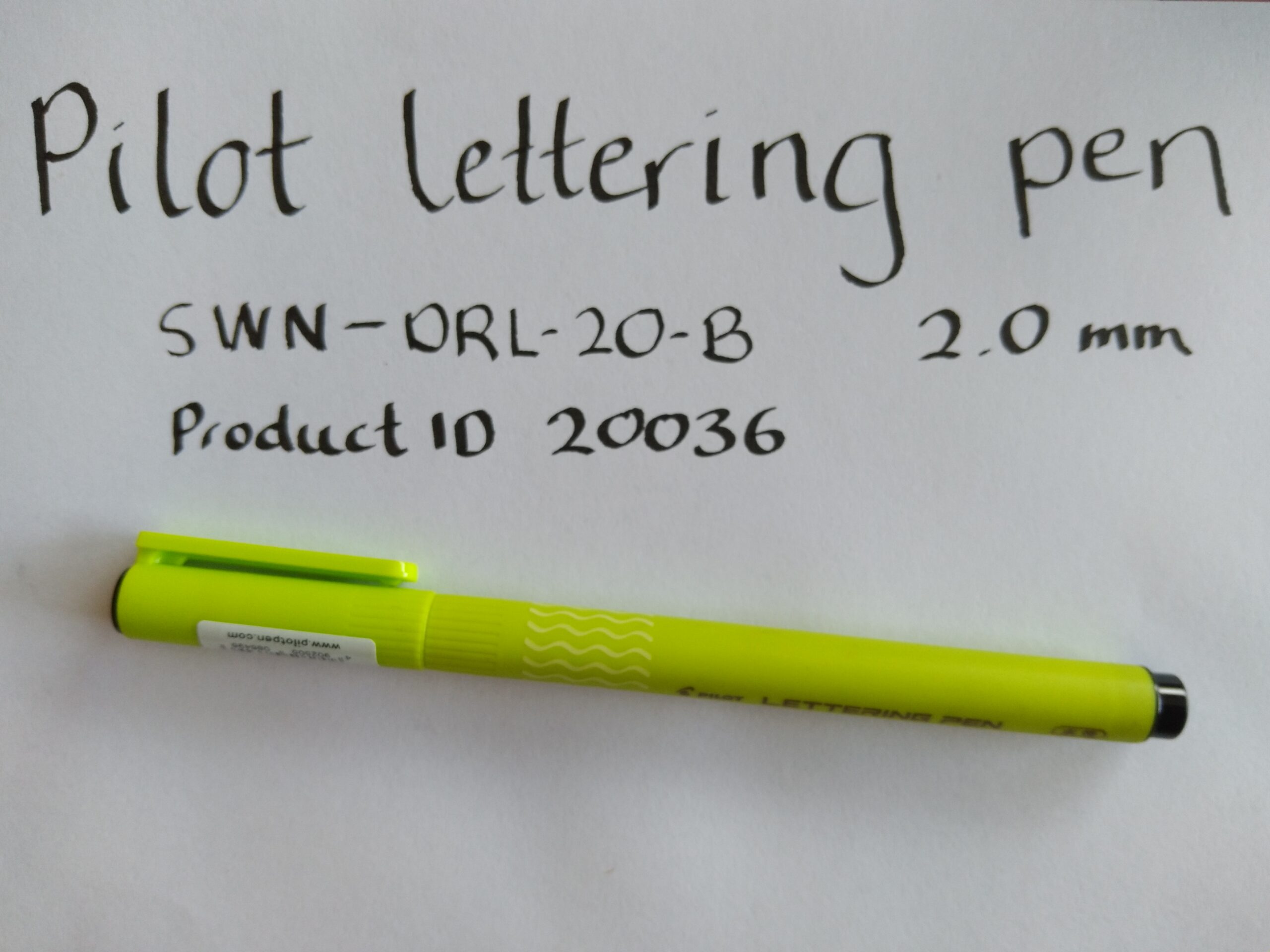
Figure 3: Pilot Calligraphy Lettering Pen with 2mm tip size in use.
I also had to try the music staff nib….as an amateur pianist who dabbles in a few other instruments, I had visions of incorporating some written music into artwork or using it to practice music theory. It seemed too fun not to try, and you never know when you might need to draw 5 parallel lines for some reason! With my runny ink, I found the top and bottom lines turned out thicker than the others – I will have to experiment further with that too.
I’m going to have to get my hands on some Herbin calligraphy ink to carry on practicing – it comes in some vibrant colours! I’m going to try again and do some more practice. It’s great for mindfulness, I reckon. Life can be pretty stressful at the moment – art, craft, music all helps. Get in touch with your inner artist/child/creative side!
I just used regular printer paper – this is a hot press type of paper that is smooth and works alright for calligraphy. Cold press paper has a rougher surface so tends to catch on the nibs and help splatter the ink and absorb it quickly, so isn’t ideal for calligraphy.
Anyway, it was a bit fun. Not as fast as designing something on a computer and popping it out of a printer, but fun never-the-less!
To get started on calligraphy the easier way, check out our Pilot calligraphy pens in 1mm, 2mm and 3mm tip sizes. I like using our Pilot Calligraphy 2mm Black Lettering Pen for doing some interesting lettering with ease (Figure 3)!